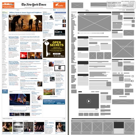
Wirify is a bookmarklet that lets you turn any web page into a wireframe in one click. It’s free, easy and fun to use. To use Wirify drag the link below to your bookmarks toolbar (or read detailed instructions):
Then go to your favourite web page and click “Wirify by Volkside” in your bookmarks toolbar – it’s as simple as that!
Read the original Wirify introduction (Dec 2010) on the Volkside blog for background information and discussion.
Wirify is created by Jussi Pasanen for Volkside in Melbourne.
Follow @jopas, view Jussi’s LinkedIn profile or read his bio.
The following wireframe has been created using Wirify 1.5 and besides basic cropping and resizing it is completely unedited:
» View and download more example wireframes created using Wirify
Source: The New York Times
» View and download more example wireframes created using Wirify
Video introduction
httpvh://www.youtube.com/watch?v=XgzPHFRx-xM One-minute video introduction to Wirify
Why would you use Wirify?
There are some compelling reasons for viewing a live web page as a wireframe:
- The wireframe allows you to step back and see the big picture. By tuning out the detail it lets you study the building blocks of the page and their relationships.
- The wireframe is a great learning and teaching tool. Many of the design concepts that underpin page layouts become easier to identify and analyse in a wireframe. Think visual hierarchy, whitespace, symmetry, chunking, grid systems, golden ratio, rule of thirds, etc. etc.
- The wireframe is a useful redesign tool that stops you getting bogged down in detail in the very early stage of a website redesign project.
- The wireframe looks cool. You can now turn all the live sites in your portfolio into large wireframes and plaster them on your studio walls

Source: Introducing Wirify: The web as wireframes
New: Read a case study on how one of our customers are using Wirify Pro to speed up their website redesign project.
Example: See page architecture without content bias
The following are direct quotes from Andrew Hanelly’s excellent post 3 Web Design Tools for Non-Web Designers Who Need to Explain Design Ideas:
How this is helpful: Biases are a hard thing to turn off when you’re looking at a site’s structure. It’s almost impossible not to be swayed by the content of a page when you should be evaluating the underlying architecture.
Wirify.com has been great for when I want to illustrate what makes a site great without people being distracted by the site itself. Sometimes I’ll Wirify something, take it into photoshop (or print it out) and write labels on the boxes to show how an idea would work for a project.
Thanks Andrew for sharing your experiences!
Example: Comparing page layouts
Here’s an example of using Wirify to compare homepage layout and structure between two major mobile phone manufacturers:

Sources: Nokia USA and Samsung, Dec 2010
The page layout and structure of each example are the property of the respective website owners.
This page last updated on 8 Aug 2020


